Project overview
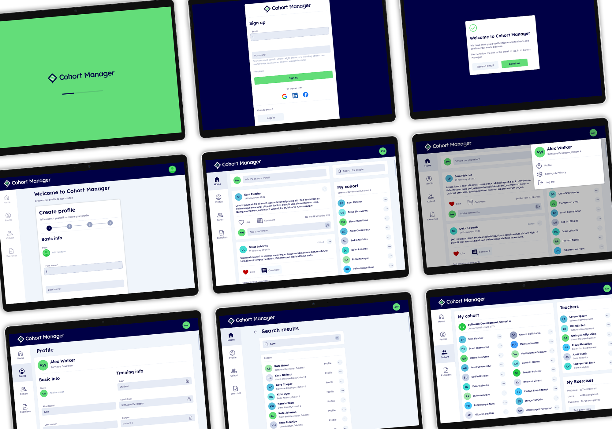
Cohort Manager is a web app we designed for Boolean, a tech training academy who teach software and front-end development (as well as data analytics). The project included delivery of a full design system – brand identity, style guide and component library – as well as comprehensive high-fidelity user interface (UI) designs for the entire app.
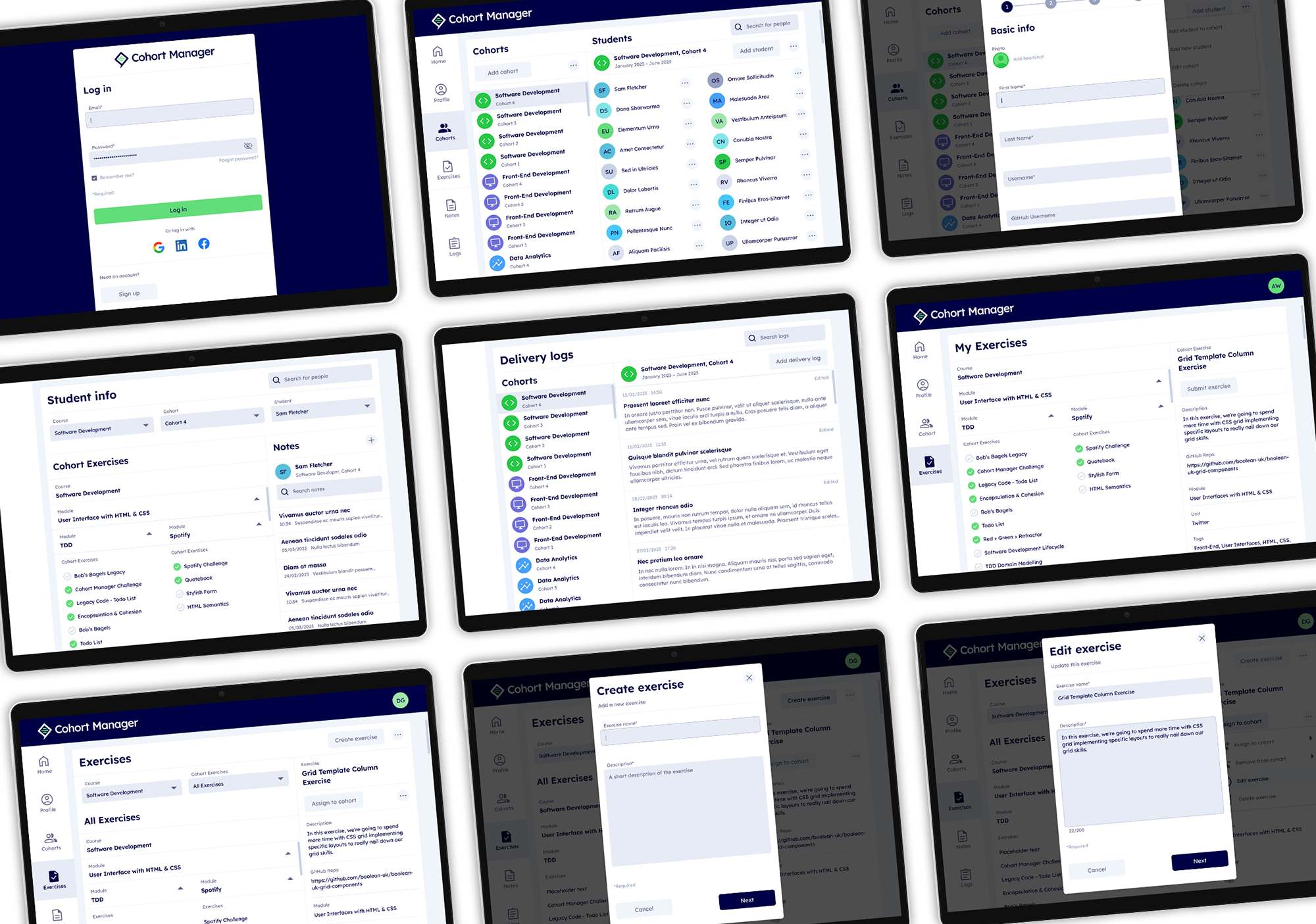
The brief was to design a web-based app, primarily designed for desktop and tablet, that would allow teachers and students to communicate and engage with each other, track progress with course modules and for teachers to manage their students and cohorts.
Info
Services: product / user interface (UI) design, brand identity, design system.
Team: product manager x 1, product designer x 1, teachers x 4, software developers x 4
Software: Figma, Adobe Illustrator
Time: 6 weeks (equivalent)
Year: 2022
The app is actually a training tool for teachers and students (software and front-end development) to develop their software development skills to an industry-standard level, enabling them to work from Figma designs and prototypes as they typically would in industry.
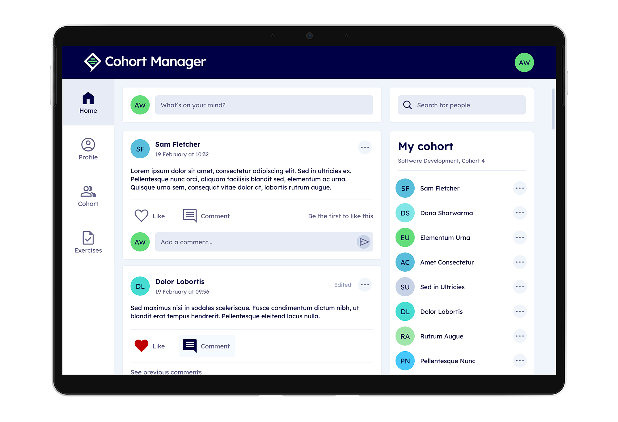
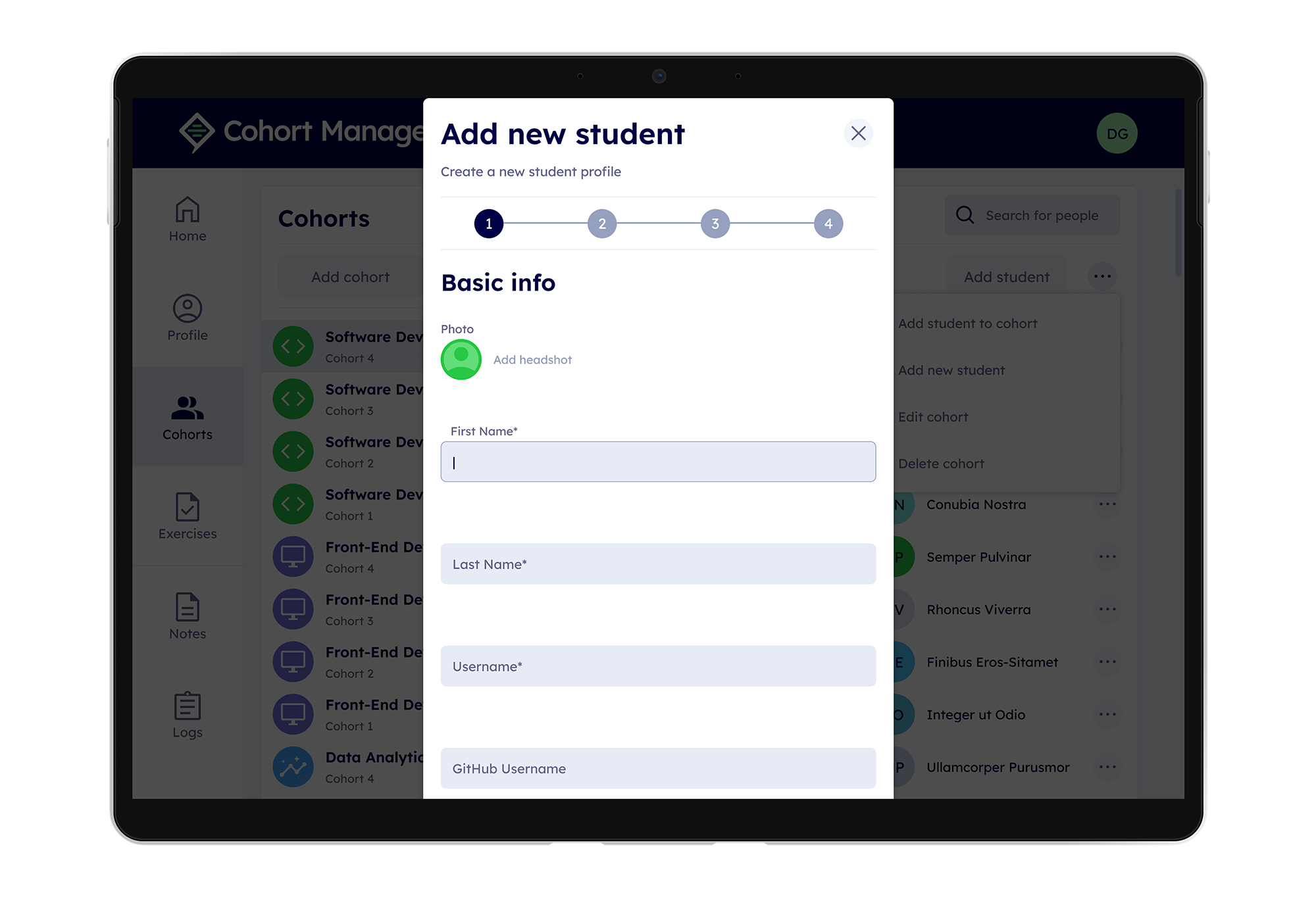
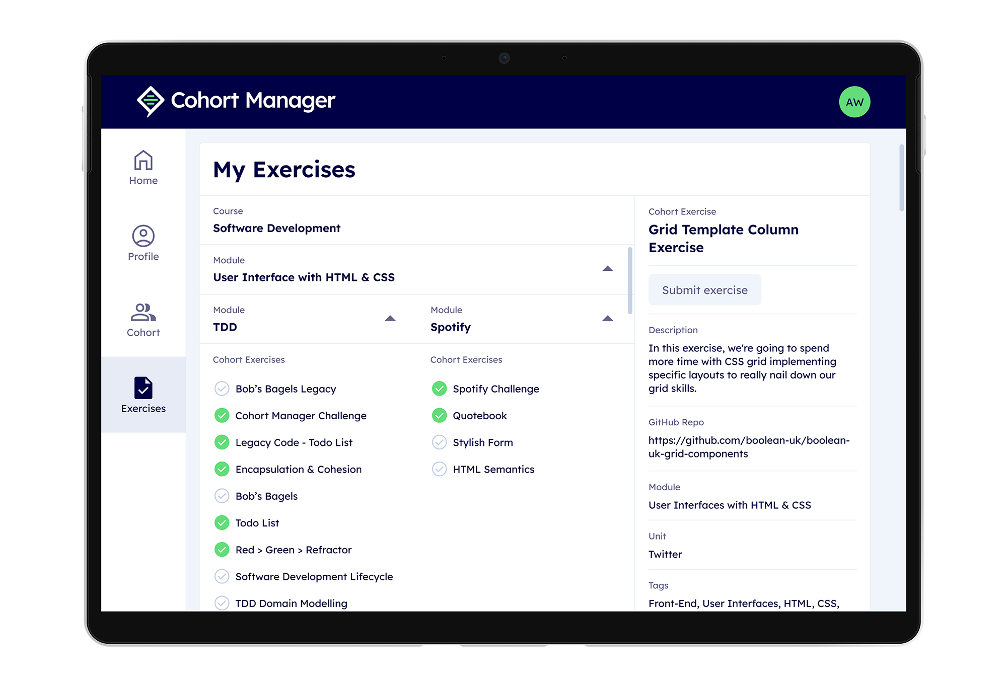
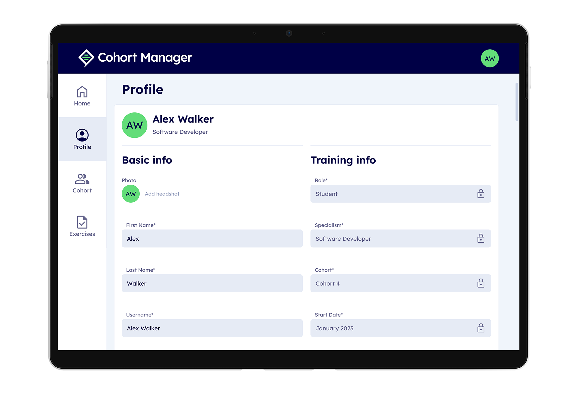
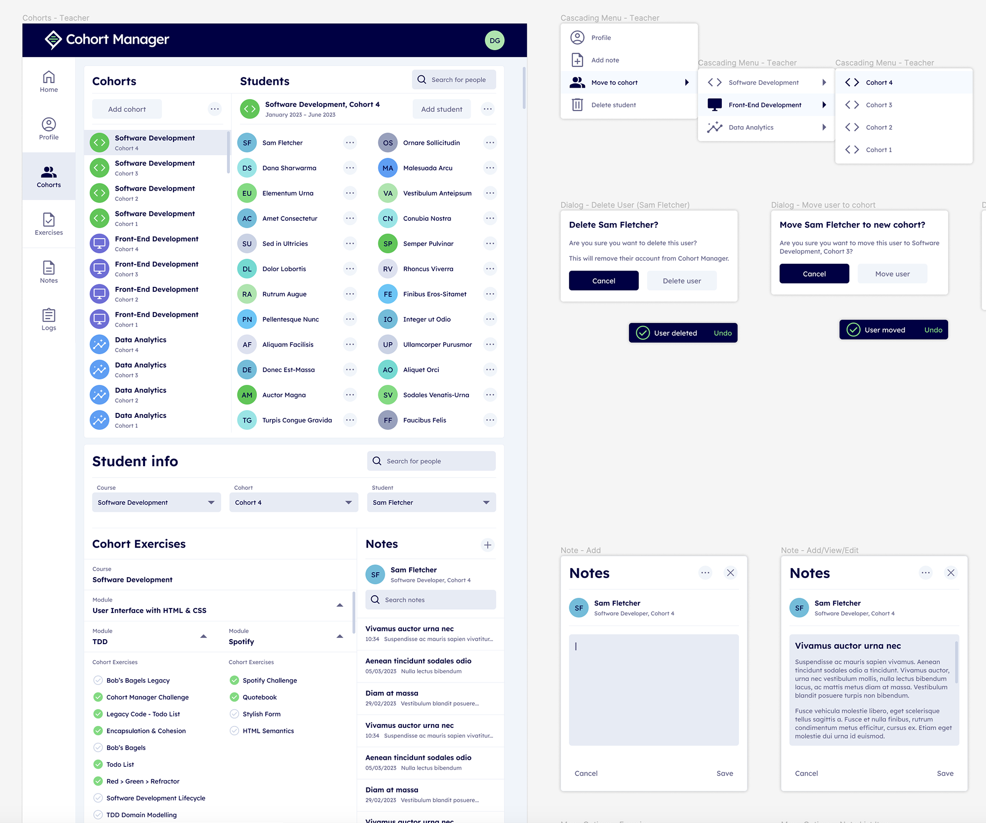
Features and functionality required included a social feed with user likes and comments, profile editing, user search, tracking progress with course modules, the ability for teachers to manage students and cohorts, create/edit exercises and assign them to particular cohorts, make notes on individual students and write delivery logs on their teaching for a given cohort.

Problem/Solution
The teachers and trainee software developers (students) at Boolean had already started building the app, but one of the key problems was that the students were wasting a lot of development time trying to figure out what the app should look like, in terms of high-level structure and user flows, look & feel, layouts for individual screens, right down to designing individual components and states. This didn’t necessarily play into their strengths as software developers/engineers and took time away from what should have been their main focus. The resulting app also didn’t look visually up to professional standards, despite being technically functional.
So the product manager decided to invest in a proper design process that would give the software developers a set of professional-standard designs to work from, with full product designs sitting within a wider design system (style guide and component library). This allowed the software developers to focus squarely on what they should be focusing on – building the app – with a professional result they could be proud of.


Process
Early on we developed the brand, with particular focus on the logo, colour palette and typography, elements which would all be central to the UI design, especially the look and feel. The brand was designed to echo the parent brand of the product owner Boolean – with a distinct rotated-square logo device, clean and clear typography and a striking use of navy blue paired with vibrant splashes of bright green colour.
After defining the specific requirements and functionality needed, we started planning out the overall navigation structure, dividing the app into clear and intuitive screens, to make it quick and easy for users to find their way around.
We researched best-practice examples of UI design for particular elements such as the sign-up / log-in process, social feed, navigation, forms, menus, overlays, dialogs and so on. Preference was given to keeping the UI relatively simple and uncomplicated for the software developers to build.
Wireframes
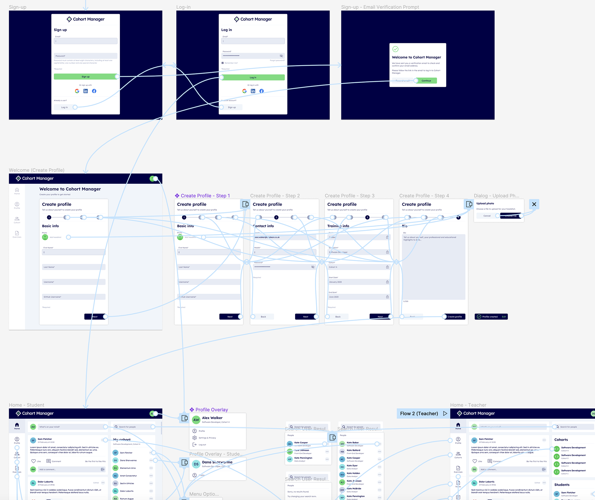
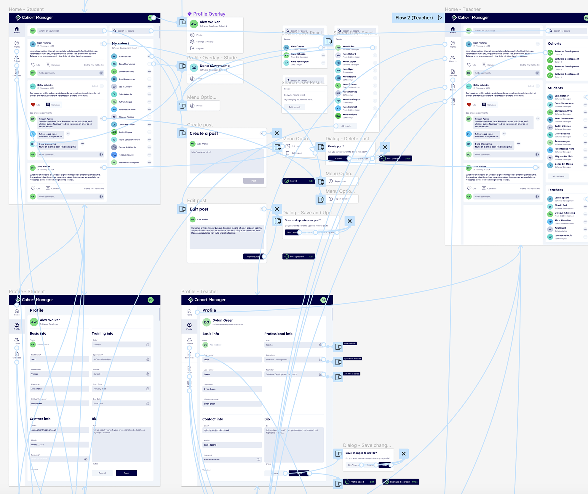
Next we developed detailed wireframe designs for the whole app, starting with the Home screen and building out from there. This enabled us to rapidly figure out the best layouts for individual screens, and how they would connect together, without wasting time at this stage on detailed high-fidelity designs. This was particularly useful for some of the information-heavy screens such as those detailing the students, cohorts and exercises. It also forced us to focus purely on the structure, layout and user flows, without getting distracted by colour and styling details at this stage.

Care was taken at this early stage to ensure all screen layouts would be responsive and able to adapt to desktop, tablet and mobile layouts, although the app was primarily designed for the larger screen sizes of desktop and tablet.
Once the wireframe designs were approved we started developing these further into high-fidelity designs, with full colours, details, accurate sizing and spacing. Components were built in Figma using atomic design principles for easier editability, with careful reference to key digital design standards, in particular Google Material Design. As the designs progressed, we increasingly defined the all the required states for interactive elements such as the buttons and forms (default, hover, focused, pressed, disabled etc).

Design System
The style guide and component library were developed in tandem with the high-fidelity screens, developing and refining the typography details (styles, sizing, spacing, colours), building out the brand colour palette with a wider set of complementary colours, neutral base colours and alert colours.
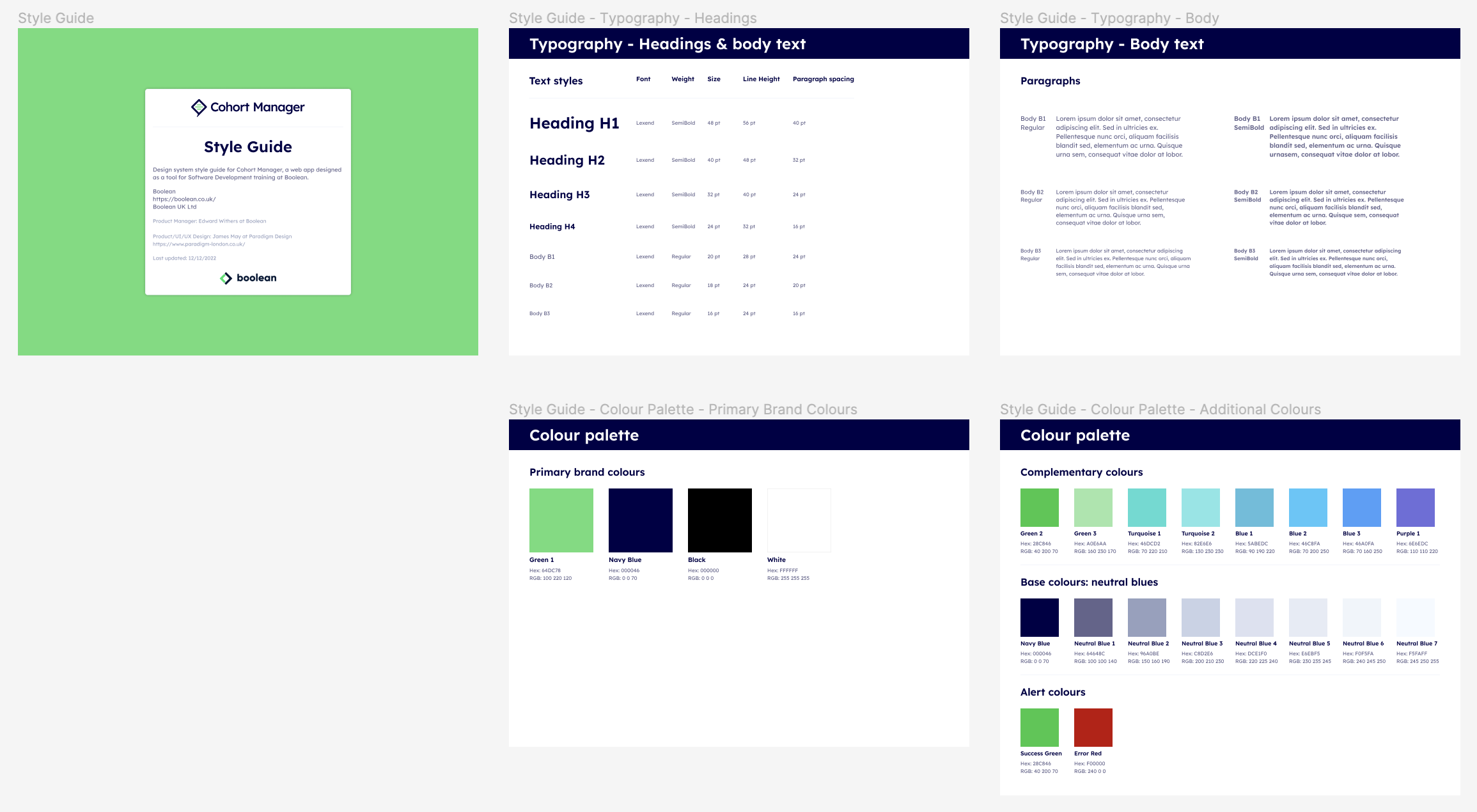
The component library provided us with standardised, reusable components such as the buttons, icons, icon buttons, navigation rail, general menus, dropdown menus, text fields, text areas, checkboxes, snackbars, tooltips, chips, progress indicators, user avatars, containers, lists, dividers, dialogs, modals and so on.
Together, the style guide and component library provided a design system that could enable product designers or software developers to rapidly and continuously develop the app with new features and functionality, while maintaining a cohesive and consistent product.


Prototyping
The next step was to add the connections and links between the different screens, overlays, dialogs and interactive elements such as buttons and menus, as well as any other interactions like form fields and exposed dropdown menus. This then gave us a fully clickable interactive prototype that we could explore and test within a web browser, making any adjustments as necessary. Once this feedback process was complete, we handed over the high-fidelity designs and the design system (style guide, component library) for the software developers to build.
At each stage, feedback was incorporated from the product manager and from a range of teachers would would be using the tool and building some initial parts of the app, with a final phase of student developer feedback incorporated once the app was in use as a teaching tool.
Challenges
Some of the key challenges included getting the balance right between needing to present sufficient detailed information to users in a clear and concise way (such as course modules information) and providing all the appropriate functionality that users would expect, while keeping the app simple and achievable for the software development students to build in the limited time available to them.
As a training tool for software developers, rather than a live product, the app relies greatly on theoretical users, rather than real users. The real users are in fact the software developers tasked with building the app, and the teachers using it as a teaching tool, which is a relatively atypical situation.
We therefore had good input and feedback from the teachers throughout the project, but not from the software developers in the initial design stages. This left us to make educated best guesses as to what the student users would find most useful from the app, relying on the experience of the teachers.
On the plus side, this situation afforded us considerable creative freedom in designing the app at this initial stage. The regular (weekly) feedback from the product manager and software / front-end development teachers was invaluable in gauging how achievable the app would be for the software developers to build in the time available, and how useful or necessary particular features or functionality would be.