Arroware
A brand identity we created for Arroware, a technical software consultancy based in Oxford.
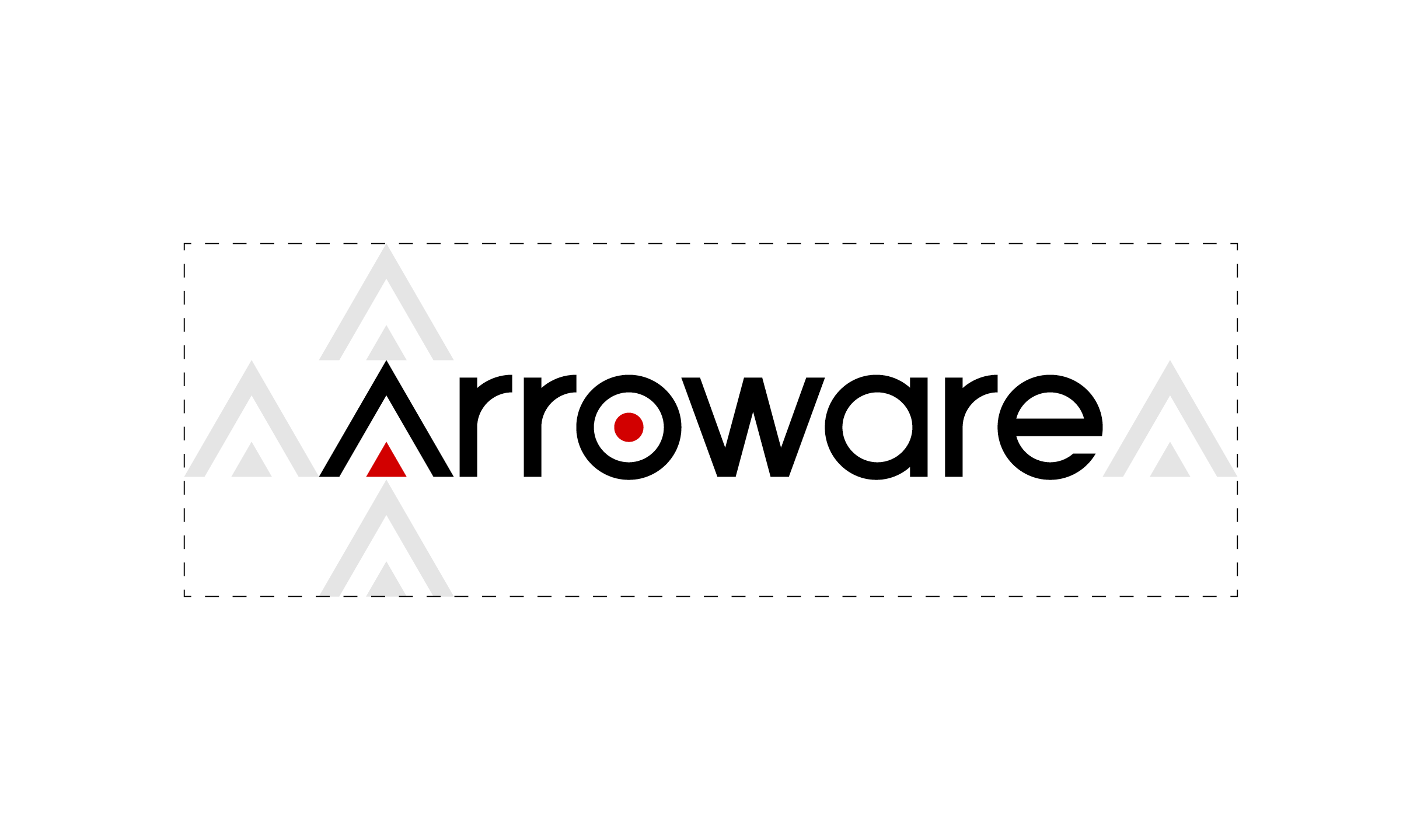
The brief from the client was to incorporate a visual reference to both an arrow / arrowhead and a target, while avoiding the pitfall of having too many conflicting ideas in one logo. We explored creative options to provide a solution that felt natural and not overloaded with different concepts.
The brand also needed to visually communicate efficiency and precision, with careful targeting of tech resources to help solve their clients’ problems efficiently. This led us to developing a completely bespoke, highly geometric logo, based on equilateral triangles and circles – to suggest precision, efficiency and rational objective thinking.

